Development Services

If you were to think about some of the biggest brands out there that you use or experience either as a service or as a product. Now, if you do so on a daily basis, why do you specifically choose them? Quality, cost, convenience? Perhaps all three?
In some cases, the reason may be a lot deeper than you think. Some products can carry a sense of purpose. You can get a feeling of trust from a brand, perhaps based on past experiences. If you have worn Nike trainers all your life, you instantly buy Nike when in need for a new trainer. The brand can carry a sense of reliance, respect, and understanding to a consumer.
This is theory that we put into practice when creating a new brand, remarketing a brand and having to fix a logo. When it comes to online projects, none became more of a task than out latest offering; BetinIreland. Let’s discuss this new website projects and all the things wrong with it and what needed fixing.
New Project
When faced with a new project, we have to understand many things regarding the business, its market, and why it has to the to stage of where it is now in needed a fix. When jobs like this come in, we need to always go back to the beginning and ask ourselves what is a brand? Now, the trick is to not think logos, colours and all the visual and media stuff that can come with it. These things, though important, are not the whole story. In fact, the brand is the story!
This is why it is important to know all the details to know the brand we are trying to resurrect and in the case of BetinIreland, its industry in casino is one of the most competitive which made this task a complete nightmare.
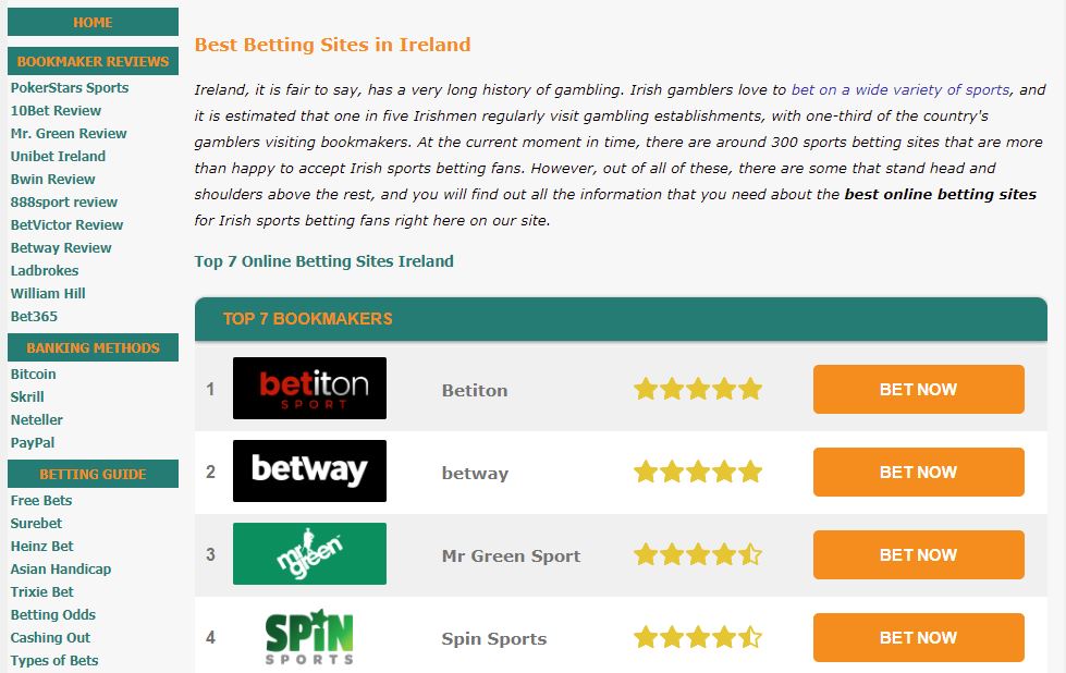
BetinIreland
So, what is BetinIreland? This is a cheap and nasty looking online casino and betting sites comparison site. You can see for yourself at Betinireland.ie that this site is void of any visuals.
Let’s first deal with the name BetinIreland. This is a weak brand name because it lacks any creativity which goes with the site on a whole.

The website as you can see from the images is all text and nothing more, information overload that bored the would-be customers into looking elsewhere than engage.
The old adage of less is more shows the people behind this website didn’t get the memo. Yes, info is good but unnecessary clutter doesn’t wash with the modern gambling consumer. The online casino user cares very little about the software developers and banking options.
For what is a site that is for players over the age of 18-years, they seem keen to make them feel that they are under that age.
There is no brand here, everything is lost in the ridiculous amount of words and adding a few highlighted text doesn’t convince anyone into thinking that it looks visually captivating.
This site borders on depressing. If this casino comparison site was as good as a representation of the industry it proclaims to endorse, then this is a massive put of and the perfect answer to gambling addiction solution. You would have to be mentally inept to look at this site and think it didn’t look fishy.
This is programming from the early 2000s and it believes it is getting away with it, just like the career of James Cordon. This site is a 100% in need of change but so great is the task that we may need to change every single thing about it, top to bottom.
BetinIreland.ie offers casino players in Ireland a top 7 list of Irish bookmakers and they provide detailed reviews and guides.
Their menu consists of the following:
- Bookmaker reviews
- Banking Methods
- Betting Guides
- Matched Betting
- Sports Betting
- Best Online Casinos
- Exclusive Bonuses
Design improvement
Strong branding is something that gives customers clear ideas of what the product is that is being sold. If we go back to the idea of Nike, with its tick logo, it has no reference to sports in any shape or form, yet it’s everything it needs to be, the mark of excellence, the tick of perfection.
With betinireland, it can be, and is, in this case, oddly obvious. With this the brand became flat. It no longer communicates; the conversation is practically dead. There is no mystery and for the consumer, there is zero interest. And rightly so, to look at it is a bore, the eyes glaze over, the words blur and you’d be lucky to awake from your coma thereafter.
A strong brand allows for people to invest in what you are trying to do and achieve, it present values and though the market here is gambling, there are zero values to warn people that gambling can lead to addiction, even cigarette packages warn people that smoking kill, here there is nothing regarding their values.
Sorting the development services
Bet in Ireland needs a lot of work. The site represents two things text and push sell tabs. The layout is cheap and because of this, they have overdone the detail and the devil is always in the detail.
Now the name of the business is where the first change would have to come Bet In Ireland, the two I’s is a rule breaker and not in a good way. Visually it conflicts and it is too flat. Many of the sites competitors have names like Ireland’s Casinos, Top Irish Casino, and Online Casino Ireland .
With Bet in Ireland, it doesn’t capture or represent to whole role of their service, so the brand rechange would start here.
As for the site, a complete rework needs to be done to strip the text, the layout need re-doing and giving it some visual and interactive qualities that users can find visually appealing and engaging to the point they click on tabs to explore the website.
Nevertheless, we have the extensive experience that is required to meet the demands of the task and to run a full strategical workshop with the client.